Rebranding Refactron
A new mark, a monochrome spec-sheet identity, and a system of 3D brand art. The look now matches the mission: prove the change is safe.

Refactron changed what it is: from an AI refactoring tool that writes the diff, to the verification layer that proves the diff is safe. A change that big to the mission deserves a look that tells the truth about it. So we rebuilt the brand from the mark up.
TL;DR
What a brand actually is
For a company whose entire product is trust, the brand is not the logo. It is whether you believe the verdict: the report you can reproduce, the UNPROVEN we refuse to hide, the change that lands only on green. The identity's job is not to create that trust, it is to look like it.
Why a new identity
The old look belonged to the old product: a refactoring tool, a little playful, a little generic. It did not carry the weight of a gate that stands between an AI-authored change and your main branch. When we ran our own verify on the pivot, the honest verdict was that the visual identity no longer preserved the behavior we wanted people to feel. It needed to read like a lab instrument, not a toy. The full record of that pivot lives on the pivot page.
The symbol
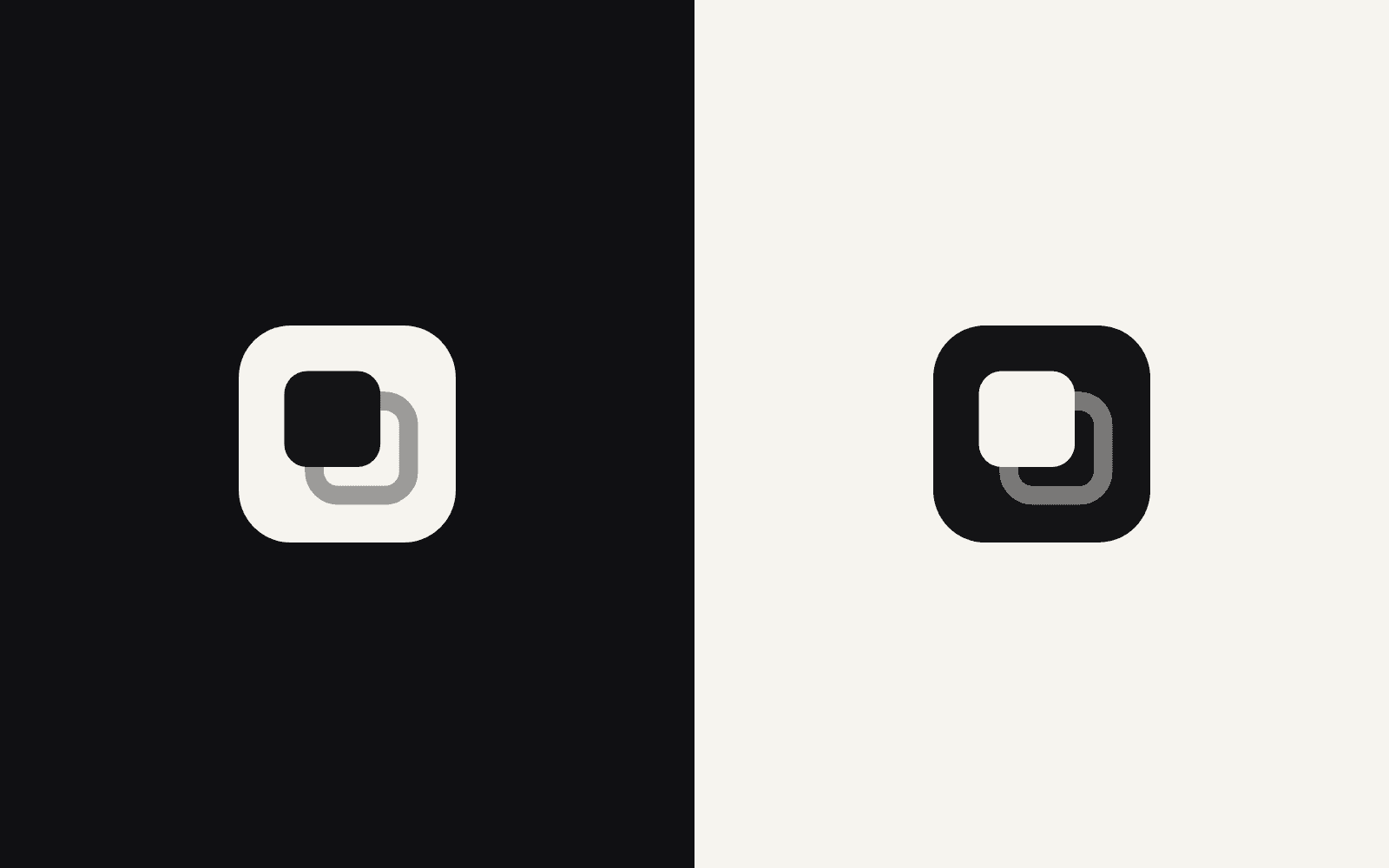
The symbol is the clearest thing we own, so we made it mean exactly one thing. Two rounded squares, one idea, and it has to hold on either ground.
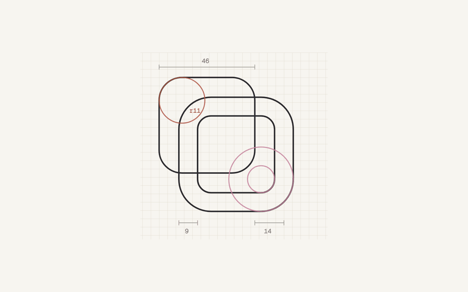
Break it down and every part carries weight. The geometry is fixed in ratios of 46: an 11 corner radius, a 14 offset, a 9 stroke. Nothing eyeballed.
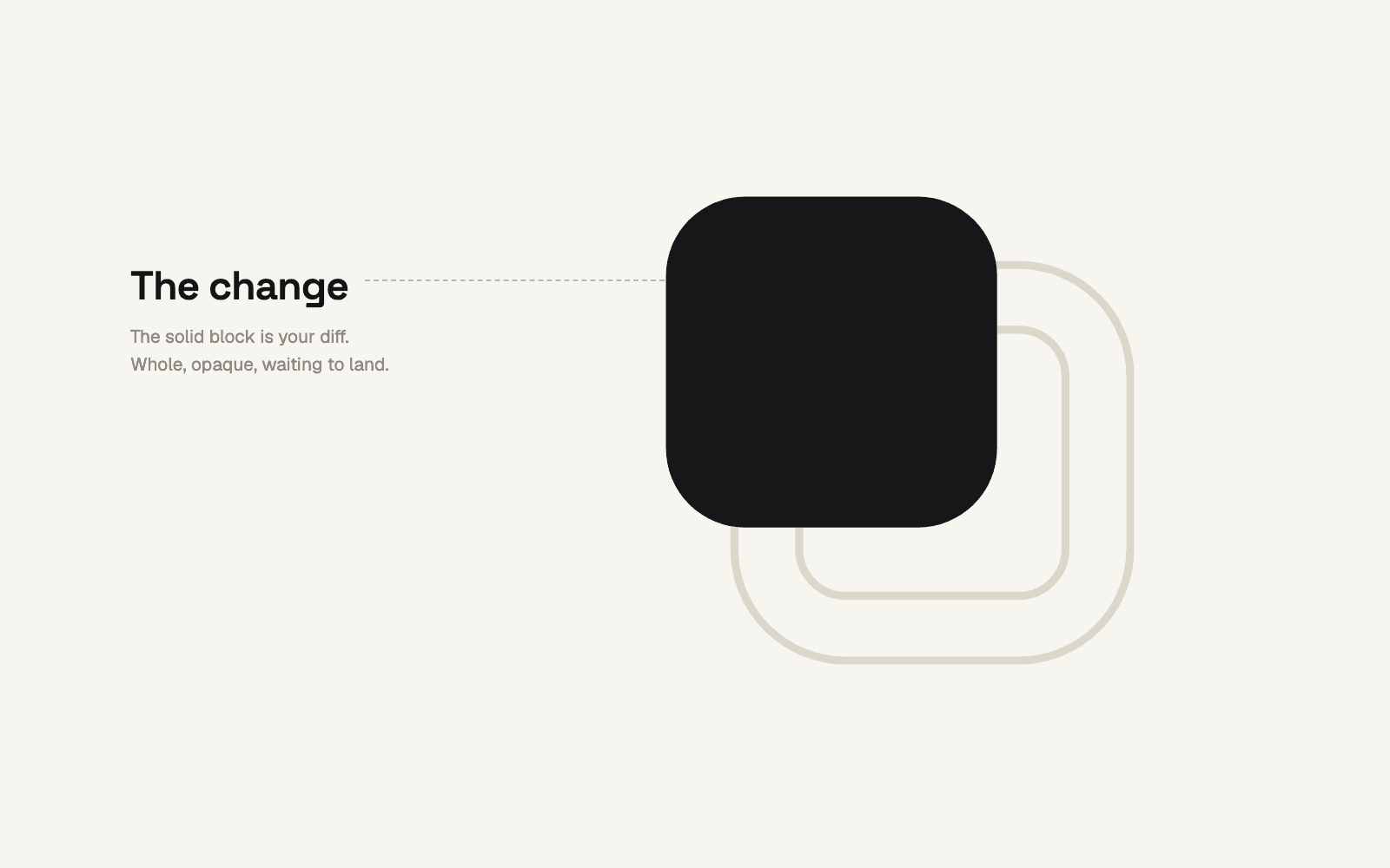
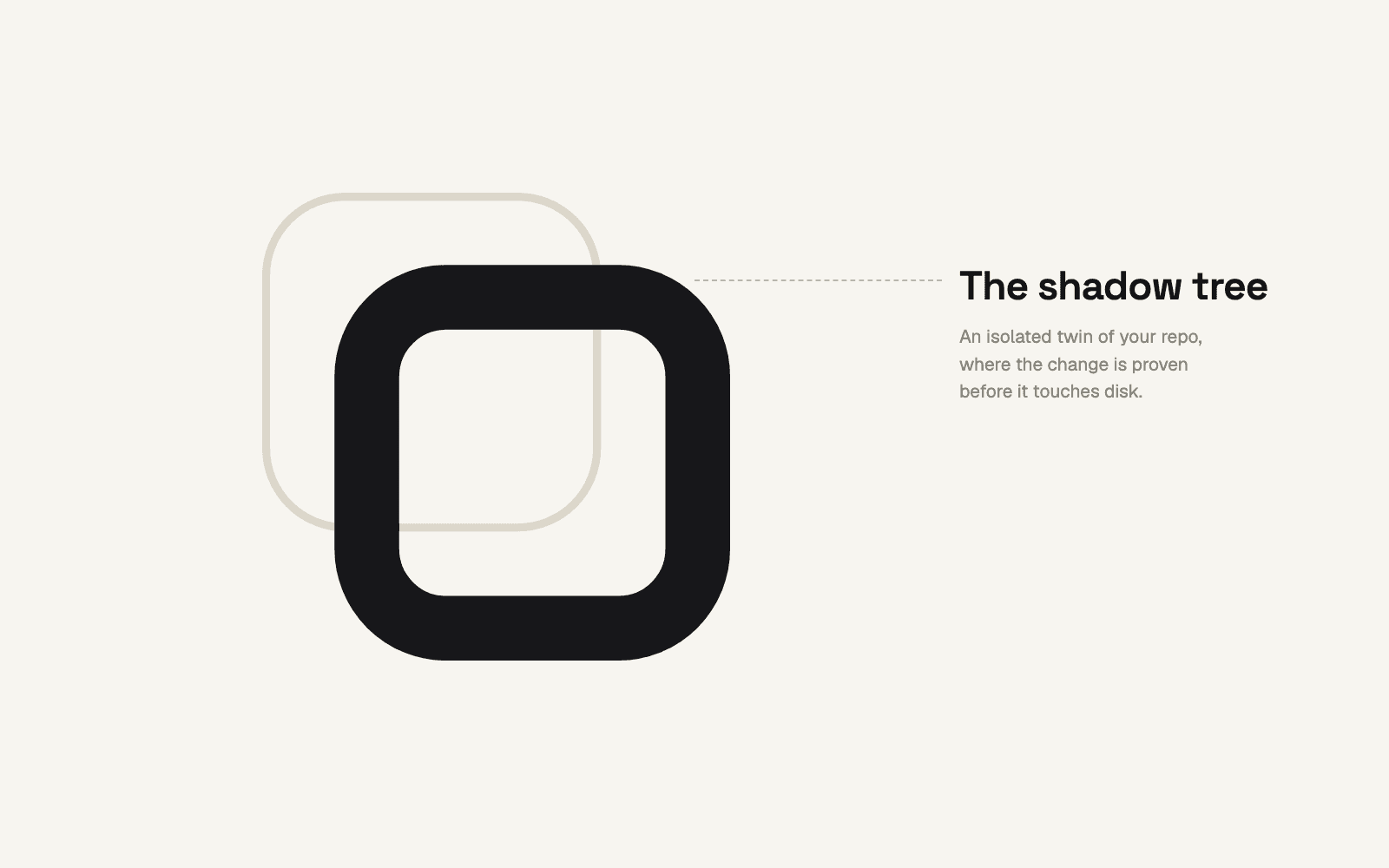
First, the solid block. It is your change: the diff sitting in front of you, whole and opaque, waiting to land.
Second, the sealed twin. The outline behind it is the shadow tree, the isolated copy of your repo where the change is proven before it touches disk.
Third, the seal. Drawn together the two squares read as one motion, and the block lands only when its twin comes back green.
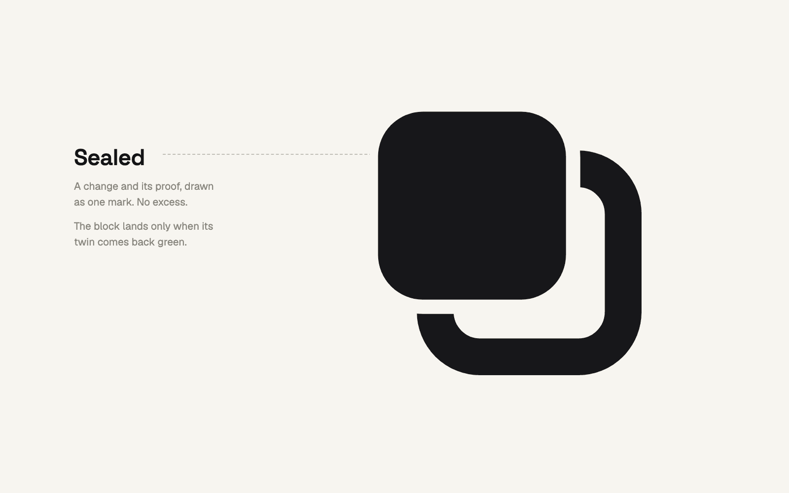
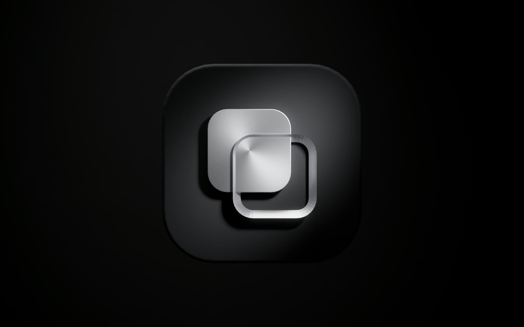
Everything else follows from that single idea. The twin sits dimmer and offset, the way a verification run sits quietly behind the work. Nothing decorative, nothing that does not carry the meaning. And because trust should feel like something you could hold, the symbol also exists as a machined object: brushed steel on a charcoal plaque.
The wordmark
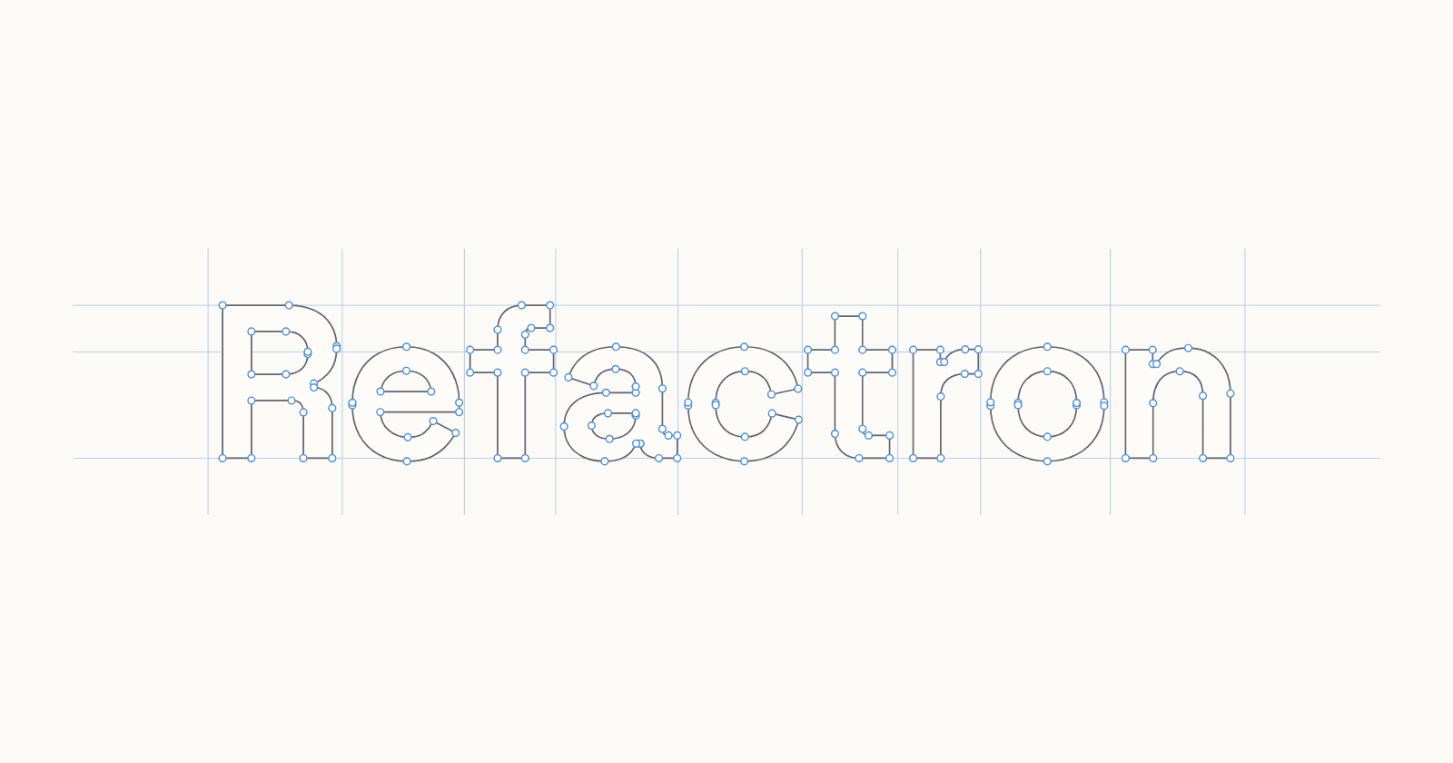
The wordmark sets Refactron in Space Grotesk, a geometric face with just enough character to feel engineered rather than default, closed with a small superscript mark. The symbol and wordmark are designed as one lockup, so the mark is never an orphaned decoration next to the name.
Each letter is drawn to sit with the symbol: the same engineered rounding, the same even rhythm, nothing borrowed off the shelf.
Typography
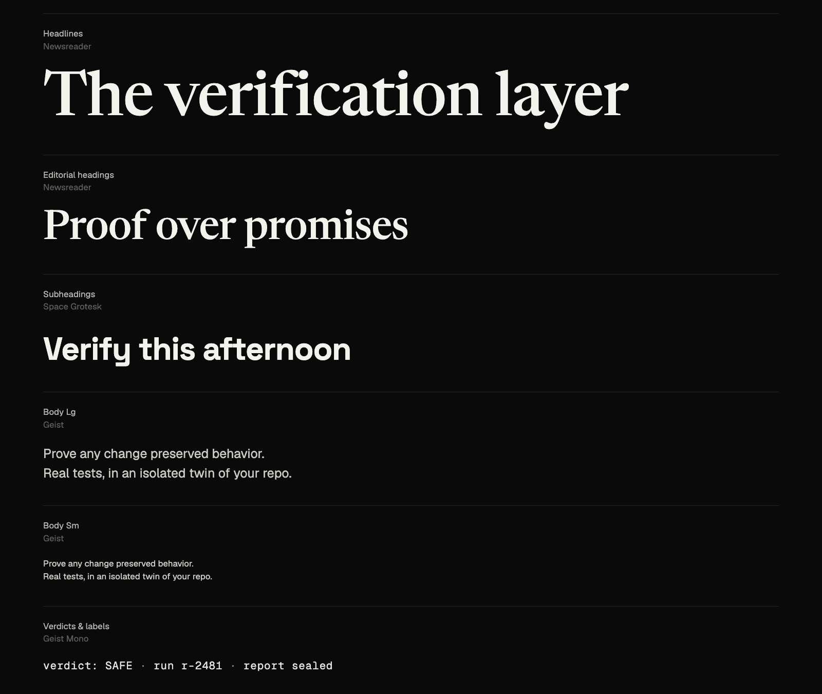
The type system is a deliberate contrast, and the contrast is the point: a serif for the things that should feel considered, a mono for the things that should feel measured.
- Newsreader, a high-contrast serif, for editorial headlines like this one.
- Space Grotesk for display and section titles, the geometric counterweight.
- Geist Sans for body copy, quiet and legible.
- Geist Mono for the spec-sheet labels, terminals, code, and every verdict.
An elegant serif next to a strict monospace is what makes the pages read as a premium instrument instead of another dark dashboard.
Color
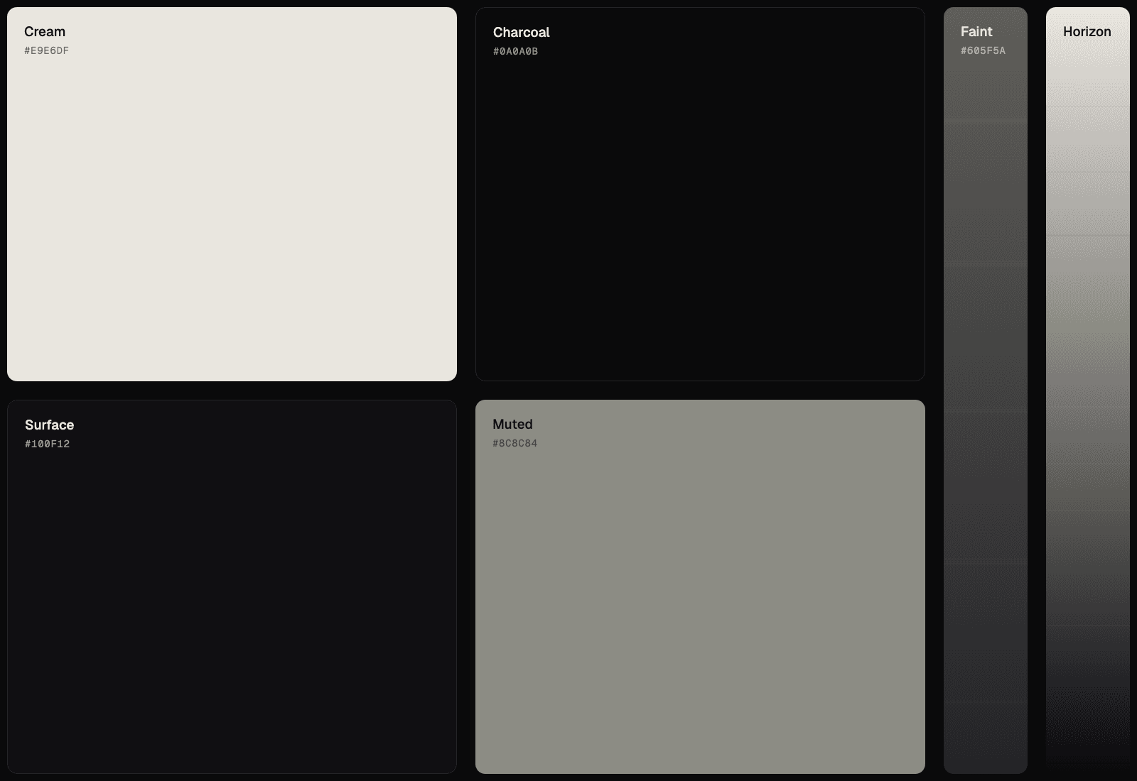
Refactron is monochrome and dark-mode first: a charcoal ground, cream text, and no hues at all. That is less a style choice than a principle, a verification tool should never ask you to trust a color. So even the verdicts are told apart by brightness and a glyph, not a green or a red.
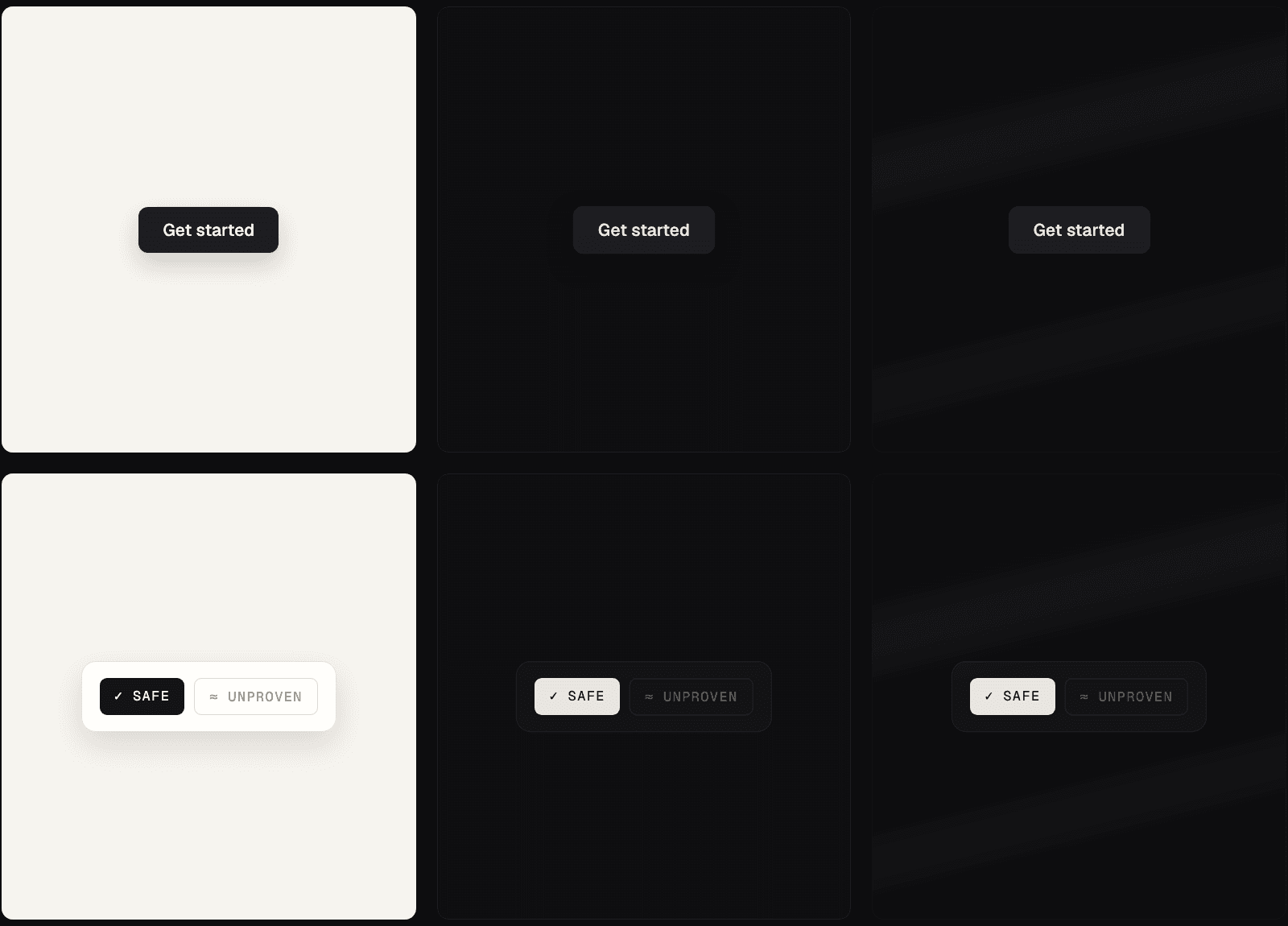
SAFE is the brightest thing on the page because it is the strongest claim. UNPROVEN is muted on purpose, because it is a caveat, not a pass. The palette carries the meaning so the copy does not have to shout.
The product
A rebrand that stops at the logo file is not a rebrand. The identity runs straight through the product:
- The verdict dossier, and the reproducible report.
- Hairline-ruled spec-sheet panels, the way a lab result is printed.
- Registration crosshairs and a dotgrid, the texture of an instrument.
It is meant to look like a printed lab result, because that is what a verification report should feel like to hand to a reviewer.
Made physical
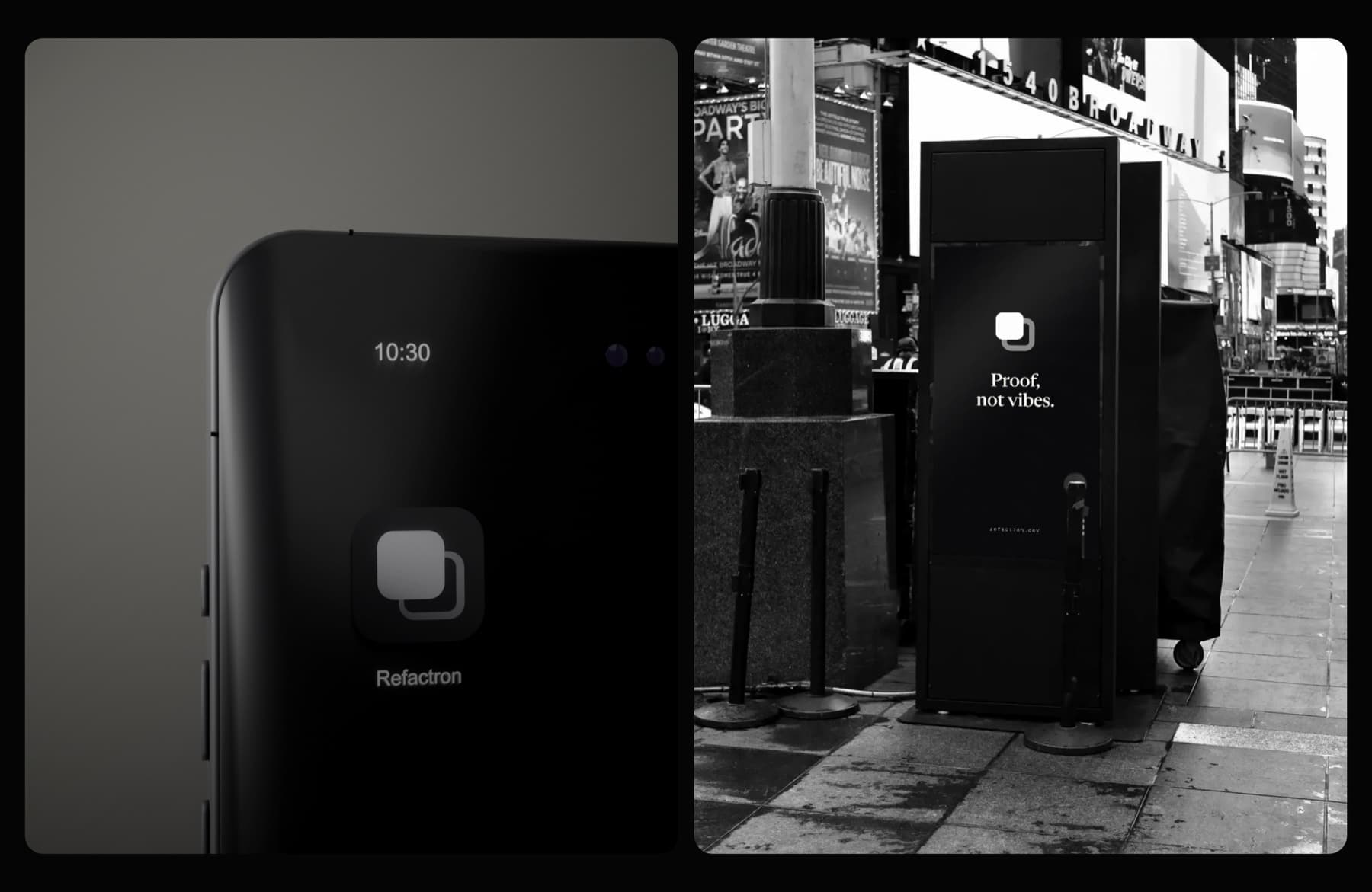
Verification is an abstract idea: an isolated tree, a real suite, a content hash. To make it feel solid, we built a system of 3D brand art, the mark and its world rendered in brushed steel, machined keycaps, and lit plaques. Real materials, real light, no gradients pretending to be depth. Trust should feel like a machined object you could hold, not a slogan.
The process
People joke that a rebrand is therapy for companies. Doing it solo, it is mostly a render loop that refuses to stop until every frame holds.
This was built by one founder, with a lot of iteration and a lot of thrown-away variations before the mark said the one thing it needed to. The constraint, monochrome, physical, honest, was the point: it kept every decision pointed at the same question, does this look like something you can trust?
The future
This rebrand is a promise more than a paint job. The identity should feel exactly as trustworthy as the verdict it wraps, and we intend to keep earning both. Thank you for building the trust layer with us. Join early access to shape what comes next.